As you might have noticed, I’m no real artist, per se.
I’m learning something new everyday and especially the combination of colors is something that I find extremely interesting, yet I fail to grasp how it works, all the time ![]()
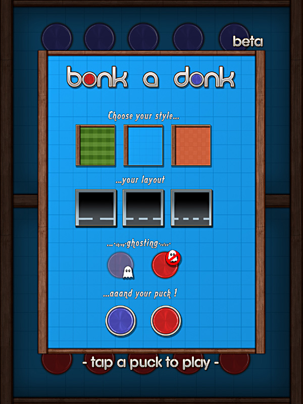
So I was kinda proud that I accidentally stumbled over something that was close to calling it a “theme” for our game.
It features the combination of “real” materials like the wooden border with some more futuristic use of gradients for the title and menus. I enjoy the combination of the retro and futuristic parts of that thought.
However when putting in the green grass and orange floor it kinda looks weird on the iPad, themewise. The blue ground still is my favorite field so far. It just plays nicely with the noble wood border, in terms of the RetroFuture aspect.
So I was thinking and thinking on how I could tie the 2 elements more together and thought “hey, why not play around with the puck and playfield colors a bit”.
One hour later this is where I ended up for now:
First iteration
It featured a set of 5 distinct technorainbow colors that look rather funky next to each other, right ?
I then added a more complex version of a puck instead of the polished/shiny plastic one, so it fits with every single of the 5 playfield variants, which was problematic with the strong red and blue variants that we feature in the current build.
Second thoughts
It looks nice and all, however I felt I should try another version which toyed with the pucks color a bit. Due to all the different colors it was (for me) impossible to find that one color that could be used throughout all of the playfields that didn’t make my eyes jump out of my skull and commit suicide.
So with some cliché multiply/overlay tests I found the nice strong and glowing combination below. I’d really like to test this version as well. It has a much more interesting and eye-catching factor to it, while still staying within the theme. However it might a tad overboard and less subtle – which was my initial idea for the game.
Third time’s the charm
The last iteration is a mixture of both worlds. It features the colored pucks as well but with less sparkle, glow and saturation. I would love to test this version as well, just to see how my eyes trick me into preferring this or that while on the iPad it looks totally different, cooler or less cool.
Personally I looooove the new look since it has a much more interesting, colorful and stylized approach to it. But now all of the menu mockups as well as the game’s logo are slightly questioned again.
Colorwise it’s really nice how the logo is set apart. But since the game doesn’t feature the plastic pucks anymore it seems misplaced to have it on the game title. Still it looks cool in a way, in my opinion.
Argh, what shall we do ?
Happens to me all the time. Circular development is something I’m horribly good at. “Oh I don’t like this aspect, let’s change it….Whoa looks great, but now this and that doesn’t fit.”
I guess the only way out of it is to:
1) Develop all art assets on one weekend and never touch it again
2) Iterate and gather feedback to make best of both worlds
I choose the sandwich !


