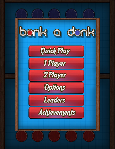
…and we’re having another go at the main menu screen, since Lukas brought in some valid points:
There were some points that I didn’t agree too, but I failed to send the comprehensive email, until now, since I managed to screw up the file units on the exported meshes of the playfield, over and over again. D’oh !

Yay, red on blue background looks more sharp! What about making the “Quick Play” button bigger? I think most players will tap that one first and it brings you right into the action (aye?)! And probably some spacing between “2 Players”/”Options” and “Options”/”Leaders”?
And now I`ll be silent, I promise!
yada yada, mr.knowitallbetterandalwaysbeingright – argh
Will do will do !
Yup, I like this one better too, and totally agree with what Ruben said (and now he’ll be silent, he promised )
)
he never will be
And he’s awesome for that !