So, finally Lukas hit me up with some more precise specifications for our graphics department today:
- We’re aiming at iPad2 and iPad3 or 768×1024 and 1536×2048
- Since its a portrait app, this is an aspectratio of 3:4
- We do both devices to share the same graphics. As upscaling graphics will look horrible, we should choose to aim for the highest resolution, 1536×2048, and let the device scale that down to 768×1024 when on an iPad2. Luckily the aspectratio of both devices are the same so scaling it down exactly two times will still look fantastic.
So what do we have graphics wise ?
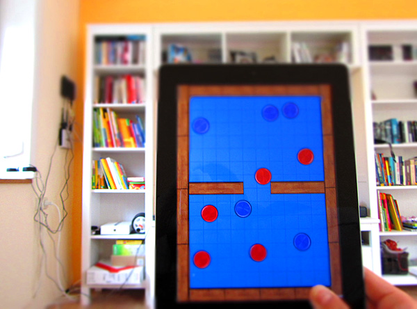
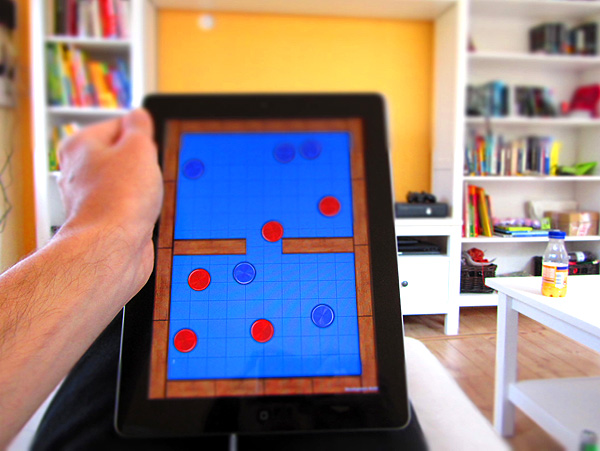
- 4 types of playingfields, with different colors and patterns
- pucks
- walls
- shadows
Things to keep in mind:
Lukas biggest concern are the texture sizes. We cannot just put in a 2048×2048 texture for the playingfield, shadows and walls. One 2048×2048 texture, 32bits uncompressed, is 16MB. This not only eats texture memory but also increases load times a lot.
The solution is to be smart. Like the playingfield, if we create a tileable version like we have in the current version, we save a lot of texture size without losing quality.
The playingfield
The playingfield is just a big plane with the size of 1536×2048 onwich I put a texture and tile it. The texture should be square, power of two and tileable. The size depends on the size of tiles, my guess would be that it ends up being 256×256 px.
Since we have multiple types of playingfield colors and patterns I want to take this one step further. If we would make the tileable playingfield pattern not colored but in greyscale I can then use a shader to color it. Black would be fully the choosen color (like red green blue and pink in the designdoc) and white be lighter. Its just like the Color Overlay effect in photoshop, I have attached an example of this. The cool thing is we are not limited to jut four colors but we can do any color we want, even while ingame.
Whats your opinion about this method? Do you think it will work for you?
The shadow and walls/borders
This shadows are very important for the look of the game, without them the playingfield will look flat and too “cartoony”. This will not be one big plane since can’t tile anything and the texture would become 2048×2048.
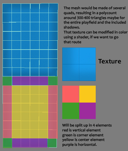
What I want to propose is that you create a simple flat mesh which holds the walls/borders and shadows. With some smart UV’ing I’m hoping we can put the shadows and walls in a 1024×1024 texture but this is really up to you. It should be 1538 units/meters wide and 2048 units/meters tall. This may seem really big to you buttThe camera is setup so one unit is one pixel so the graphics are pixelperfect and positioning is easy.
The mesh will look like a square 8 or like the purple area in the photoshop file I’ve attached. I absolutely can’t do Max so I may have said some stupid things here  Warning, in no way I can do art or photoshop so its just to help explain what I think we should do.
My idea so far:
Basically the playfield would consist of one mesh that is split up in many many little modular quads, that is build up and mirror via UV’s.

For the wooden border I was just planning to create 3-4 different texture pieces that I can use modular to not make it seem too repetetive around the playfield.
I made a texture at 256×256 resolution, since I planned to put all the ingame stuff on a 1024×1024 texture, including, score font, “You win”, pucks, wood border, shadow and ground. Guess we’ll have to see about that – haha 
So, now it’s my turn to “finalize” the first draft of the actual art assets for the game to take the next step.


